Friday, 27 February 2015
contents page layout
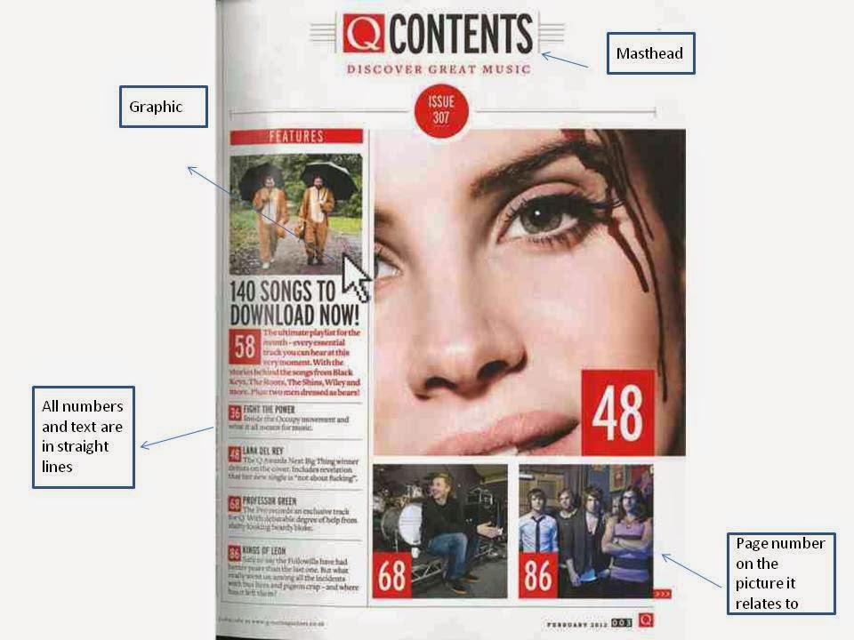
Above is my prezzi presenting the main features found on magazine contents pages when looking at its layout
Tuesday, 24 February 2015
Contents page shots
Here are some of my test shots for my contents page. I have not decided which ones I will use and I may take some more based on what my target audience say about the shots.
Saturday, 21 February 2015
Wednesday, 18 February 2015
Front cover audience feedback
Though my magazine is finished there are a few things that I could change to make it of a better quality.
From my audience feedback I realised that the price is a little to big and should be made smaller. A few of the features on the magazine could do with more text so that all the space is being used. Apart from this my magazine appeared to be of a good standard.
Sunday, 15 February 2015
Link to research (front cover)
My research into pop magazines showed me that red, black and white stood out the most on a magazine front cover and so I decided to follow convention and according to my audience feedback it worked well.
When looking at my survey research most people said they would pay £0-£2 for a magazine and so I decided to charge £1.99 for my magazine.
In my focus group one participant highlighted the fact that the models makeup matched the features on the magazine, so I decided to give my model red nail varnish to wear so that the features on the magazine could match the makeup.
Most people say that the image on the front is what draws them to the magazine and therefore I decided to make sure the models angle of gaze was towards the camera and therefore looking straight at the buyer.
Friday, 13 February 2015
Front cover text
There are 3 main types of text used on my front cover (highlighted above). The reason I have only used 3 types of text is because this is conventional to my music genre. This ensures that the magazine does not look to chaotic and doesn't take the attention away from the artist/model on the front cover. The 'special addition' sign uses serifs to make them stand out a little more as it contains important information to read.
The text is placed around the model and no text flows onto the models face. This is so that the angle of gaze is not covered and no attention is taken away from the image.
I chose this content as it was suited to the genre of pop as shown by my research into different magazine covers.
Sunday, 8 February 2015
Cover layout
To the left is my flat plan and to the right my final cover. I have changed a few things from the flat plan to the final piece, however the general layout has remained the same. The picture is positioned in the same place however the text has been moved around a little more. The '2015' text could not be placed lower in the picture as there was a problem with the black blending in with the models hair. To fix this problem I raised the text which meant I also have to raise the circle advertising the new column so that not too much of the models face was covered. When looking a little more at pop magazines I noticed one in particular had the barcode under the masthead and thought that it worked quite well so I experimented with positioning the barcode at the bottom of the page and then at the top. It looked nice under the masthead and managed to stand out a little more as at the bottom of the page the black bar code was becoming merged into the models hair.
Wednesday, 4 February 2015
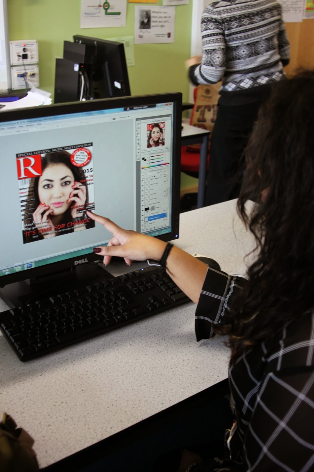
Photo Manipulation
Cropped image
Adjusted lights and tones of picture
Drop shadow with bevel and emboss to make text stand out
Highlighting text
Magic wand tool
Blemish tool/ skin corrector
Subscribe to:
Comments (Atom)


